Mobile First Design
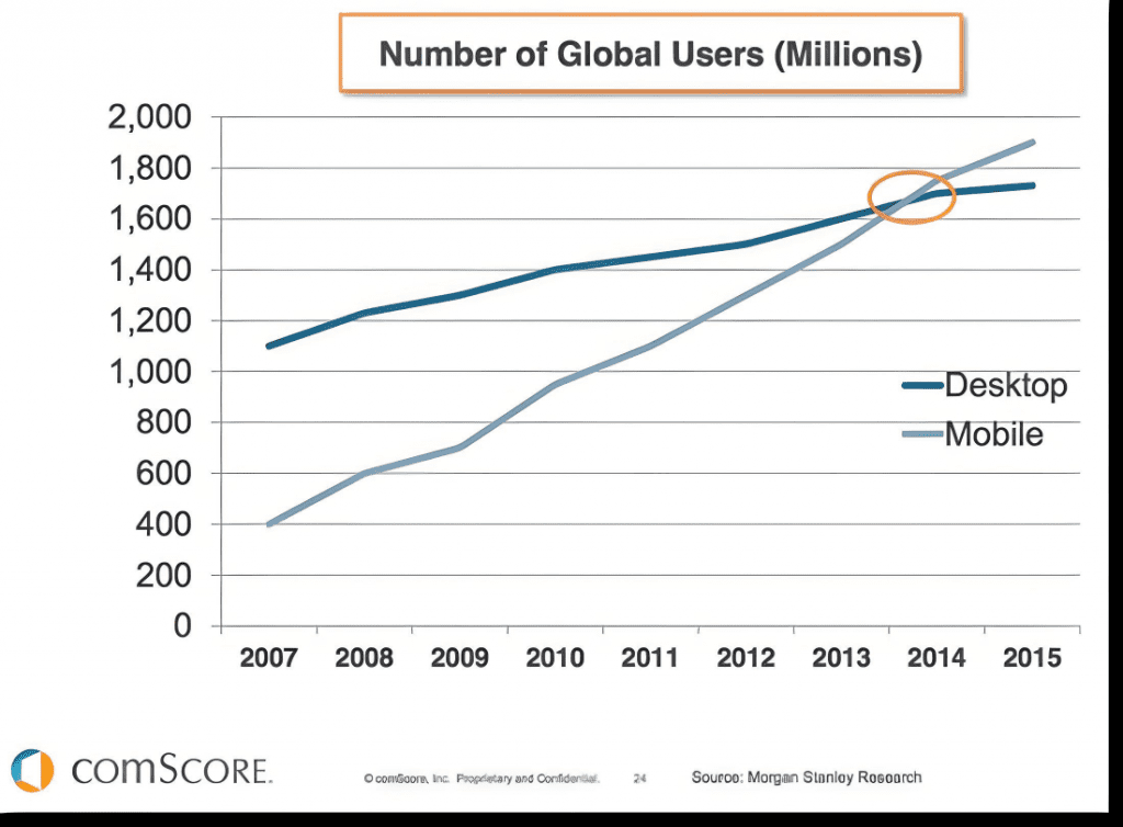
The rapid increase of users who use mobile devices for their internet browsing, reinforces the approach that must be given to the compatibility and adaptability of web pages for mobile and tablet devices.
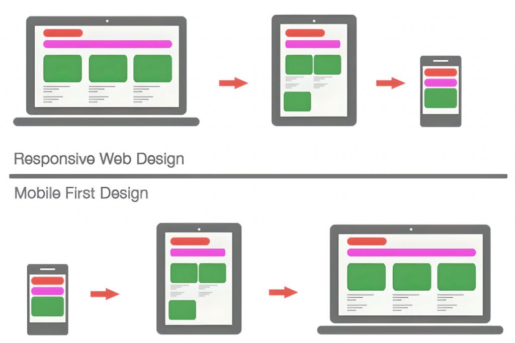
The Mobile First Design model refers to exactly that, designing the website first for mobile and then for the rest of the devices.

Unlike desktop devices, where two pieces of content on a web page appear side by side, on mobile devices each piece of content appears on top of the other.
So, on mobile devices, the most important content appears at the top of the screen and the less important elements follow below.
