The Psychology of Colors
In this article we will discuss the psychology of colors and how they can affect the human brain.
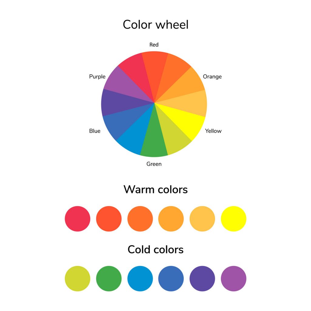
Colors can be divided into two basic categories, warm and cool colors.
Warm colors represent passion, excitement, power and energy. The most common warm colors are red, orange and yellow.

On the other hand, cool colors such as blue, purple and green represent calmness, stability, professionalism and give a sense of reliability.
We should emphasize that even though most colors fit into one of two categories, each color has unique characteristics that cause specific stimuli in the human brain.
So let’s explore each color separately:
Yellow
The color yellow stimulates mental thought and the nervous system. It activates memory and is considered one of the happiest colors in the color spectrum.
It is a vibrant color that exudes optimism, happiness and creativity.
It attracts attention and creates a warm and positive atmosphere.
However, excessive use of yellow can be off-putting, so it should be used sparingly or in combination with other colors.
Appropriate use of yellow in web design can stimulate users to a sense of energy and joy.
Green
Green induces a relaxing sensation, both mentally and physically, and helps relieve nervousness and anxiety. For most people it provides a sense of renewal and harmony.
It is closely associated with nature and growth and evokes a sense of freshness, health and environmental awareness.
Brands that focus on sustainability or organic products can leverage green to communicate their core values.
Incorporating greenery into design can create an attractive and more harmonious experience for users.
Blue
Blue creates a sense of calm. It promotes productivity and reliability.
A typical example are the logos of well-known companies such as: Facebook, Google and LinkedIn, which use blue as the main color.
Lighter shades of blue exude serenity, while darker shades of blue give a more serious and professional style.
Additionally, applying blue in web design can help create a good user experience.
Purple
Purple is considered to be associated with spirituality and creativity because it results from mixing blue with red.
It is usually associated with luxury and exudes elegance.
Incorporating purple into design can evoke a sense of opulence and appeal to audiences looking for a more refined experience.
Pink
Pink gives the feeling of energy, like red.
It inspires confidence and is considered to be a youthful, fun and exciting color.
It is a color synonymous with femininity, tenderness and romance.
Brands targeting a female audience or related to beauty and fashion often incorporate pink to create a strong emotional connection with the audience.
The strategic application of pink in web design can evoke a sense of glamour.
Red
It stimulates energy and action and attracts attention more than any other color.
However, it is important to note that the color red can also be associated with caution or danger.
Properly incorporating red into web design can evoke a strong emotional arousal and highlight important elements of the web page.
Orange
Orange stimulates activity. It is also considered to whet the appetite.
It inspires sociability and is one of the most controversial colors. The reason is because it will either be liked a lot or not at all.
It is often used to highlight call-to-action (CTA) buttons or important elements on a website, stimulating user engagement and increasing conversion rates.
White
It symbolizes new beginnings and promotes a sense of clarity. The color white is one of the most neutral colors in the color spectrum.
It plays an important role in design because it is used to create white space, which helps users have a better navigation experience on a website.
It is also often used as a background color in minimalist or modern designs.
Gray
Gray is considered to be the color of intellect. It is also seen as a sophisticated and elegant color.
Black
It is considered to be a restful color, like the duration of the night.
It promotes a sense of power and authority.
However, it can cause strong emotions, such as hatred.
When combined with other colors, black creates high-contrast patterns and conveys a luxurious atmosphere.
Incorporating black into web design can enhance brand credibility and leave a more lasting impression on users.
The use of Colors in Digital Marketing
In the field of digital marketing, colors play a key role in attracting visitors’ attention, evoking the right emotions and conveying a company’s message or identity.
In addition, they play an important role in designing a good user experience (UX) in digital marketing, which significantly affects the effectiveness of your strategy.
Therefore, understanding color psychology can enable graphic designers, web developers and digital marketers to create top-notch creative, engaging websites and successful campaigns that will resonate with audiences and deliver significant results.